Your Full-Service Retirement Readiness Partners
We design and execute a complete financial plan for you so you can focus on what matters most
FEATURED IN*


You are incredibly thorough and walk me through this financial stuff in a way I can understand. And you have helped us through some difficult times in our lives. I know you’ll always have our backs.
KIM D.
This is a testimonial of Berkshire Money Management (BMM) by a client of the firm. BMM has not provided any direct or indirect compensation for this testimonial.
When people first come to us at BMM…
They’re often retiring, selling a business, receiving an inheritance… some new event has set their money in motion. And they want it handled right.
They’re looking for trustworthy, proactive financial advisor who:
Can help you know if you’ll be financially secure long-term

Can help you identify your best options to plan a comfortable retirement

Can create and carry out your plan for you, from start to finish
If this sounds like what you’re looking for, we invite you to give us a call
We’re friendly and easy to talk to.
It’s More Than Just Money Management
We help you with ALL parts of your financial life.
It’s been 20 years… Now that’s a relationship.
S. C.
This is a testimonial of Berkshire Money Management (BMM) by a client of the firm. BMM has not provided any direct or indirect compensation for this testimonial.
Many of our clients are…
Retiring
Professionals
Want to avoid running out of money?
New Neighbors
from NYC
Want help with your new estate tax reality?
Business
Owners
Want to maximize the sale value of your business?
Advisory Case Studies
Example client stories to show how we can help

Time for a Change
Alex & Andrew felt ignored by their former advisor. They wanted a fresh start, but wouldn’t trust their accounts to just anyone…
CONTINUE READING →These case studies involve real BMM clients. Names and details have been change to preserve anonymity.
Berkshire Money Management was founded on an aspirational vision…
Insights and Advice
Read our take on the Economy and Modern Finance
Dreams Achieved, Disasters Avoided
Our advisors share stories of how we’ve helped our clients
READ OUR SUCCESS STORIES →
You are by far the most proactive, hands-on financial advisors I have ever had.
MICHAEL F.
This is a testimonial of Berkshire Money Management (BMM) by a client of the firm.
BMM has not provided any direct or indirect compensation for this testimonial.
Want us to help you replace your paycheck in retirement?
It’s just a friendly phone call away – Click the button below to pick a time to chat
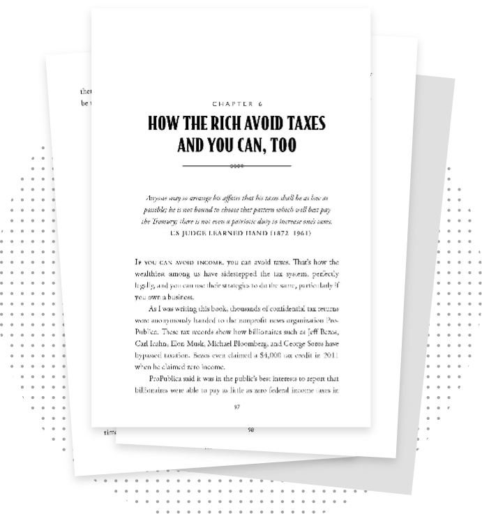
Free Chapter
How the Rich Avoid Taxes & You Can, Too
Download Chapter 6 of “Don’t Run Out of Money in Retirement.”
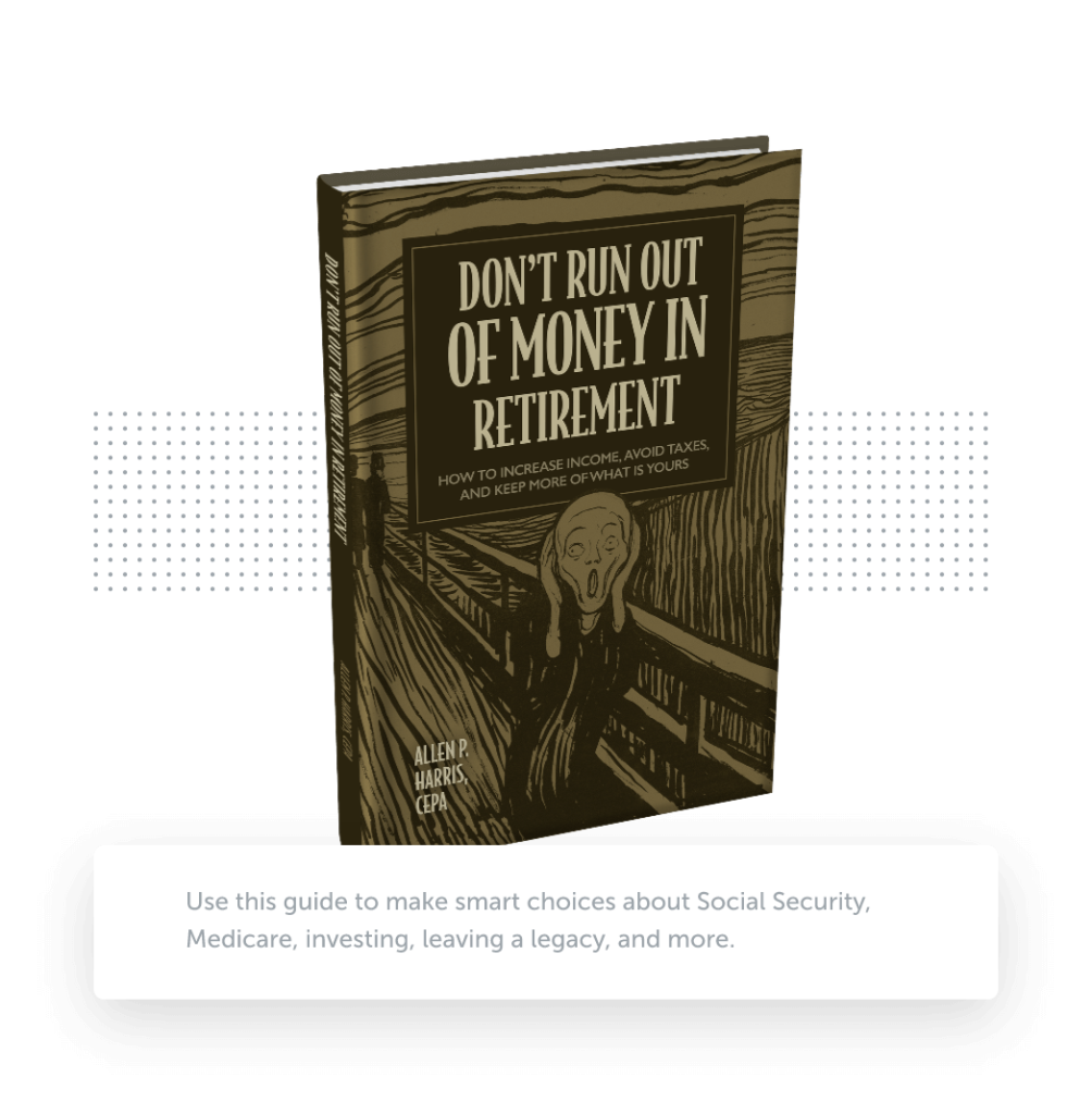
Will your savings last through retirement?
In Don’t Run Out of Money in Retirement: How to Increase Income, Avoid Taxes, and Keep More of What is Yours, veteran money manager Allen Harris helps answer this question — along with many others you might have.
**These are testimonials of Berkshire Money Management (BMM) by clients of the firm. BMM has not provided any direct or indirect compensation for these testimonials.